6 things experts get wrong in headwall design
“The details are not the details. They make the design.” – Charles Eames
Fine details such as a photo on a restaurant menu, a green “download here” button on a website or the order products are placed in a store aisle can greatly influence our behavior.
Small details go a long way in design, too. It’s what Apple’s success is all about: obsessive attention to detail, down to the smallest parts and pieces.
And it pays off. In fact, getting these small things right is how we began in the patient headwall business.
Patient headwalls are architectural features that merge electrical and medical gas functions into a single unit to increase efficiency. However, the design of many hasn’t changed much since they were conceived in the 1970s, according to Human-Centered Design of E-Health Technologies: Concepts, Methods and Applications: Concepts, Methods and Applications by Martina Ziefle.
Yet so many headwalls are uninspiring, unappealing and unhygienic spots on the wall your eye immediately scans right past. So let’s look at a few problems that typically plague headwall design. Here are the 6 things experts get wrong in headwall design:
 What’s wrong with the typical headwall?
Trip hazards
First on the list of things experts get wrong in headwall design is that many don’t actually solve the problem they’re meant to. While headwalls are designed to corral cords and reduce trip hazards, the reality is that in many cases, there are still loose cords and things for nurses and doctors to move out of the way.
It’s even worse in a crisis situation. When a medical team is actively administering emergency care, they often have to move the bed away from the headwall to reach the patient’s airway, Ziefle reports.
Terrible design
Hospitals installing headwalls have two routes they can choose – a standard, “off-the-shelf” product or a custom design. The standard product is cheaper and quicker to arrive, but offers less customization and isn’t optimized for the ergonomics of a particular space or team. Custom designs offer those options but command according prices and lead times.
Medical staff have demanding jobs that require their full attention. One mistake can have ramifications far greater than the average desk job. So why is it that so many headwalls offer complicated add-ons to their product that complicate a nurse’s job?
Complicated details
Rails, snap-in/snap-out outlets and mounts for equipment may be nice features, but they may also overly complicate an already complicated job. The memory demand on nurses is reduced when rooms are streamlined and furniture and technology standardized.
Headwalls are no exception to this burden on staff. Adding extras to them that change in different makes it that much harder for users with a limited time to reset – and with a critical burden to “get it right” every time.
Poor material selection
Other “upgrades” often seen are headwalls covered in fabrics or wood finishes instead of plastic. Not only unappealing visually (often, but not always), these finishes are also unhygienic, especially if the surface is scratched or damaged.
Fabric and laminates cannot be used in critical spaces such as ICUs. Given the rising rates of secondary infections in hospitals in general, it should also be asked: why are they being used anywhere in a healing space?
It all starts with the right toolset
Enough about the problems, though. What should architects, contractors and owners of healthcare facilities consider instead?
In our experience, headwalls work best when they blend function and aesthetics.
 FUNCTION
Functional design
First and foremost, a headwall needs to do what it is designed to. They must fit hundreds of feet of data, electrical, oxygen, vacuum and other medical gases in a compact package. They have to do it cleanly, reducing both visual clutter and trip hazards. Outlets and openings should be strategic and ergonomic, minimizing the need to stoop or bend to access them.
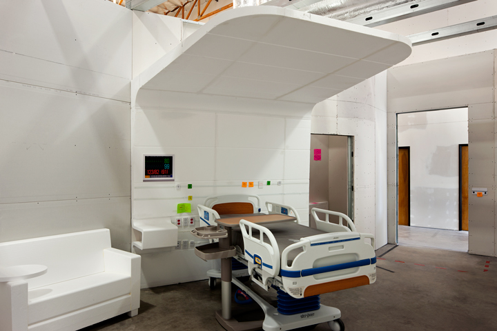
For example, when designing the revolutionary Canopy headwall for the brand-new Jacobs Medical Center at the University of California, San Diego, Cannon Design constructed a foam mockup to test functionality. The design team placed sticky notes where outlets and med gas connections went and had nurses test the functionality in focus groups.
Mass customization
Second, they should standardize the room for caregivers. Nurses shouldn’t have to waste precious time or memory resetting when walking into a room because the layout changed or the technology is different. The headwall can be a point of orientation and consistency for them when they move between rooms and floors.
However standardization can go beyond room layout. Prefabrication is a growing trend in construction and design, one that we embrace at Shield.
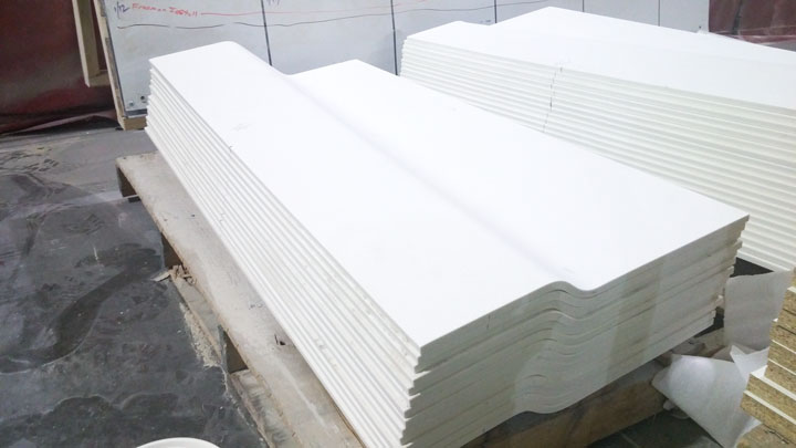
The headwalls we construct for UCSD, for example, take advantage of modular prefabricated panels that are flat-packed and shipped to the job site. Streamlining the installation, this design was simplified to allow people unfamiliar with the engineering of the piece to quickly and easily assemble this complicated-looking piece.
Cleanability
Third, they should be cleanable. The headwalls we produce clad the steel framework entirely in thermoformed solid surface, which is a nonporous and virtually seamless material. Unlike other finishes, solid surface is easy to sanitize and resistant to the spread of pathogens.
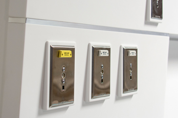
Rather than place standard outlet covers in the Canopy headwall – which would have compromised the nonporous surface – our team designed and fabricated custom outlet covers to meet the headwall’s 4-degree slope as it rises.
AESTHETICS
Headwalls can be stunning
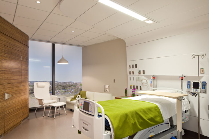
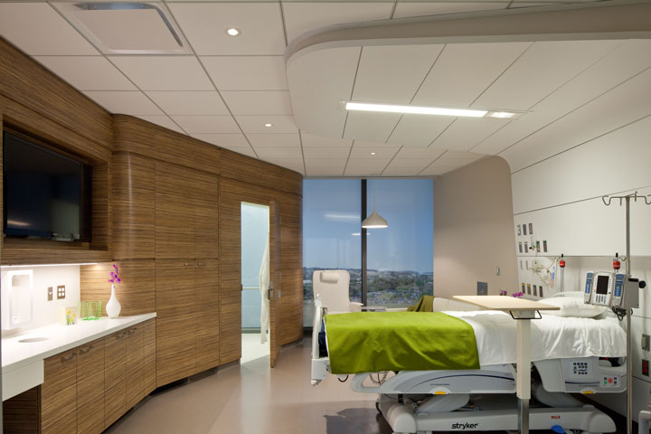
Institutional medical product can also be architectural elements that are as functional as they are beautiful. UCSD’s Canopy headwall is a perfect example: its organic and flowing aesthetic softens the space.
Technology is crucial to hospital operations, yet too often it overwhelms the space. Fitting hundreds of feet of infrastructure into one functional hub was a design and fabrication challenge for this project.
The canopy’s organic and flowing nature softens the space while its high-tech core smoothly links all of the devices. It evokes a greater hospitality feel than traditional headwalls that simply take the place of drywall, and keeps patients from feeling dwarfed by a cavernous ceiling. The canopy grounds the room in an envelope of warmth through ambient light and comfortable curving lines.
Headwalls don’t have to show technology
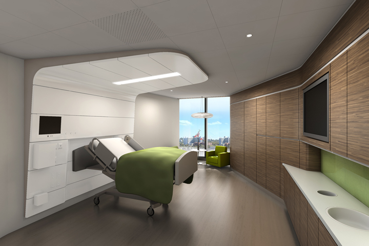
A headwall our team fabricated for a birthing center that emphasizes a natural birth experience with minimal medical intervention.
Cannon Design dreamed up this natural-looking headwall with scallops that conceal all technology and utilities, to create a complete healing environment.
Based on the hospital’s desire to provide personalized, family-centered care in these advanced, midwifery-based birthing centers, the design is natural and comforting. At the same time, it syncs patients with advanced medical technology in mere moments if needed.
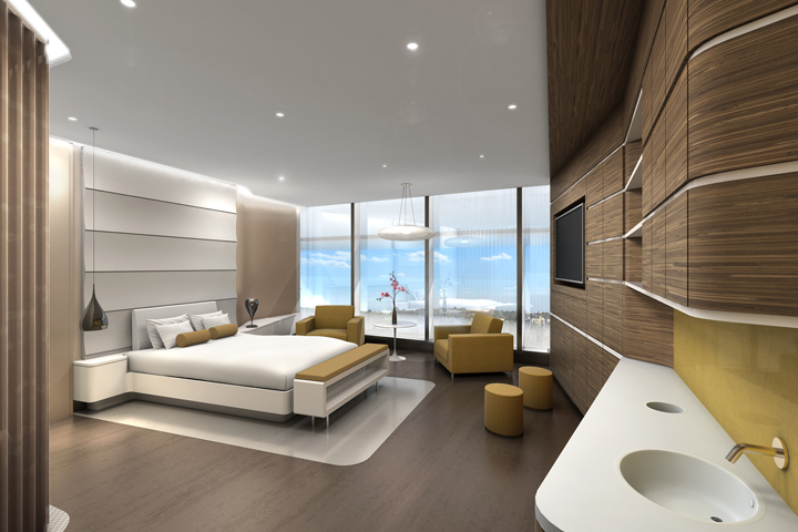
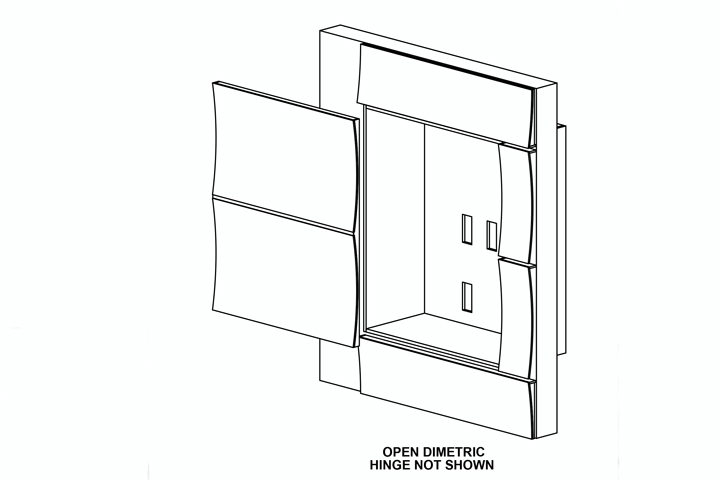
The design wasn’t easy to execute: the scalloped door weighs more than 40 pounds and is 1 and 1/2-inches thick. The hinge has to clear that, then slide over several feet to uncover the technology panel. In addition, the design team wanted matching reveals across the door, so the hardware only had a half-inch space to operate.
Finding a hinge with that action that could find those dimensions was incredibly challenging,. Our team looked at hundreds of possibilities, several different ways to build the door and even constructed three mockups.
Headwalls aren’t limited by these examples
No matter what industry you look at, it’s clear today’s markets are hungry for original ideas. Original thinking leads to original execution, setting work and clients apart.
Cannon Design and UCSD have given the design and construction world something it hasn’t seen before: two revolutionary evidence-based designs executed on a mass scale. It is clean, simple and beautifully functional design, from the large features to the tiniest details.
These two examples carry with them promise of a shift in the industry – moving from typical designs to original thinking and switching from staid, off-the-shelf products to mass customized solutions specific to client needs and spaces.
There’s more to come in headwall designs. We’re excited to see what details new designs can bring.


John Ware | Jan 29, 2015 at 6:09 am
Brilliant!
Mandy, you may remember my recent email. I understand your focus on headwalls. Smart business. Brilliant design and smarketing. Did you invent that word? I love it.
I’m deep into an opportunity that will bring my family back to Lawrence, from Abu Dhabi, and I’d really enjoy coming to Shield for a visit sometime Q2 2015 – meet you, catch up with Stephen and see Shield.
So I’ll get myself settled first and then follow up.
All the best,
John