Healthcare design doesn’t have to be ugly
Many of today’s healthcare facilities look like they jumped right off the page of a 1992 design catalog. They just aren’t that pretty. But they don’t have to be unappealing and, in fact, they shouldn’t be–at least for the benefit of the patients. Guest blogger Angela Mazzi explains the faults of most healthcare designs and provides solutions for how to overcome these problems and improve the patient experience.
Scratching the surface: how healthcare design is failing us
Unlike retail environments that nimbly shed their skins or bask in the kitsch of a bygone era, in healthcare, today’s fresh trend is tomorrow’s institutional feeling space. That’s because it’s all about superficial changes instead of more meaningful shifts in how we think about healthcare space.
This stubborn paradigm is dictating what our expectations should be. We’ve been allowing factors like infection-control requirements or functionality needs to drive us to a lowest-common-denominator solution and let us off the hook in design.
In truth, they limit us no more than any other code or standard faced by architects and designers in any building type. It’s time to stop hiding behind these industry-assumed limitations and dressing up the same old broken processes in new clothes and fancy technology jewelry. Time to stop putting lipstick on the pig.
Remember who the design impacts
As architects and designers of healthcare spaces, it’s important to remember that no one WANTS to come to a healthcare facility. Something is wrong, or it might be wrong. You had to take off of work to get here. You don’t know what might happen during that procedure. You might get MRSA. The scale of the environment is huge, and that makes it hard to find out where you need to go. Parking is a hassle.
The inherent negativity of the experience causes a phenomenon called confirmation bias to kick in. Confirmation bias involves having preconceived ideas or expectations and then only perceiving those pieces of information that validate them.
In the case of healthcare, it’s all too easy for this to happen. The fashionable wrappers applied as Band-Aids to the broken design paradigm often fail to overcome confirmation bias because the basic building blocks themselves haven’t changed. Even in the most posh interiors, patients still encounter wheelchairs and stretchers menacingly arrayed in their path of travel or medical equipment prominently on display with a profusion of wires clotting the walls, as well as an overall lack of feeling like a true participant and partner in their own care.

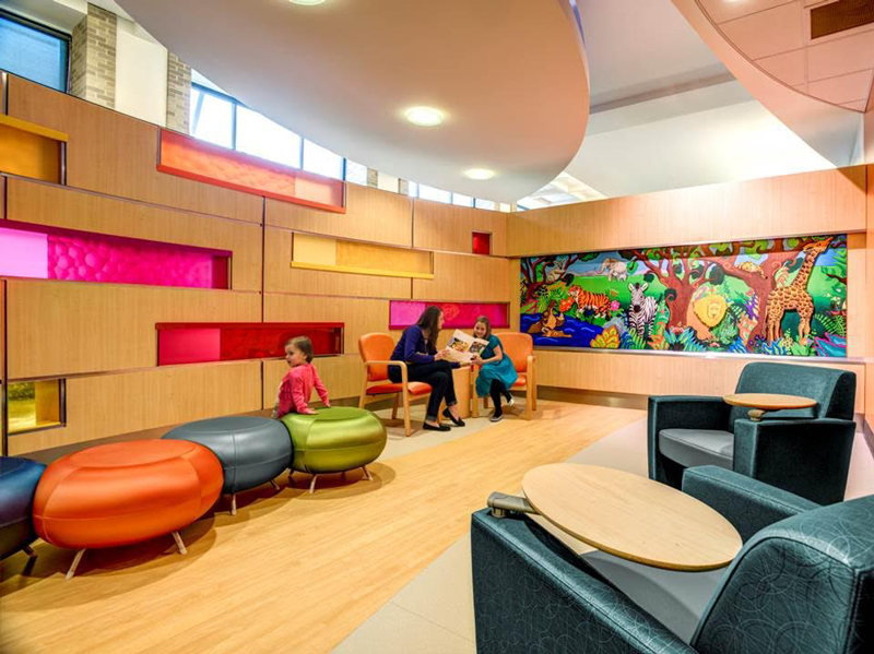
Cancer and Blood Diseases Institute at Cincinnati Children’s Hospital Medical Center. Image via GBBN, JH Photograph Inc.
The “us vs. them” hierarchy is alive and well. It’s reinforced by everything from the layout of waiting rooms, where staff members barricade themselves behind desks and comfort is secondary to the ability to be visualized, to exam rooms, which cut patients off from any sense of what is going on with their case or their provider.
Be different by doing different
Healthcare design is fraught with many supposedly functional reasons. Assumptions about what a space is supposed to look like are rooted in a culture of normalization that makes it difficult to drive true innovation and change.
Normalization is a term used to describe the acceptance of conditions, experiences and circumstances as taken for granted. We need to challenge ourselves and our clients to put patients first and to think about the emotional component of wellness.
Convenience for clinicians is not necessarily about quality of care. Often it’s about enshrining less-than-efficient habits or practices carried over from an existing space into a new design. By reexamining the characteristics of spaces and their relationships to one another, we can help our clients understand how they can work differently and overcome the resistance brought about by normalization. This is a culture change—one that requires a different design process to help produce meaningful change and, more importantly, to use the space as designed.

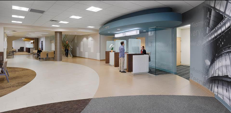
UC Health Florence Medical Office Building. Image via GBBN, Ryan Kurtz Photography
It’s all about value
At a conference, I once heard a CEO discussing proposals (design and otherwise) that had been pitched to him. His go-to answer? “If it doesn’t make dollars, it doesn’t make sense.”
Of course. Advocacy for great design solutions can never be about how cool they are. We have to map our decisions to the goals our clients have, using research to show how metrics important to their bottom line will be improved through design. We have to present cost as the multi-dimensional consideration it really is, not a construction-dollar-only proposition.
That’s called adding value, and it makes sense every time it’s tried. It helps our clients understand that design is more than just a fashionable veneer, but a process of understanding and meeting needs and providing a meaningful, innovative solution.
The fact that design can make people better isn’t just a trend; it’s an imperative.

Angela Mazzi, AIA, ACHA, EDAC, is an Architect and Senior Medical Planner at GBBN Architects. She is also the founder of The Patron Saint of Architecture, which she has owned for more than five years. Read more of her posts on the relationship between wellness and design here.


Sorry, the comment form is closed at this time.