Principles of design applied
A well-known cultural and art institute, the Getty identifies nine main principles of design that artists use in their work: balance, emphasis, movement, pattern, repetition, proportion, rhythm, variety and unity. Not every design does nor should use every principle, but the way artists and designers use these principles greatly contributes to the success and appeal of their design. Here’s a look at the principles of design applied to Shield’s products.
Balance
The concept is self-explanatory, but it primarily refers to the symmetry of objects and visual elements such as color, texture and space.
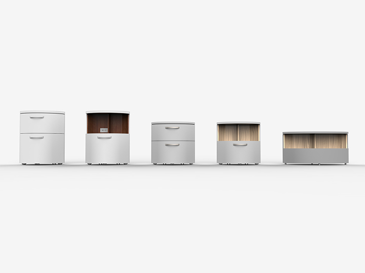
Symmetrical objects are pleasing to the eye, which is why good design typically includes this principle, as does our coffee table-night stand combo. Objects should be similar on both halves, either symmetrically or asymmetrically.
Emphasis
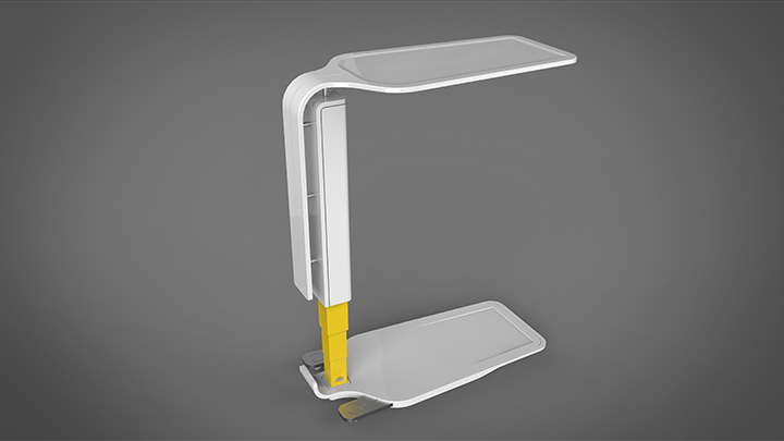
This principle of design refers to a specific part of a design that stands out to the viewer, whether due to color, shape, texture or any other element. Our overbed table includes a pop of color near the base in order to bring more life to this piece while maintaining an aesthetically pleasing design.
Movement
Much like photography’s principle of leading lines, many good designs direct the viewer’s eyes to a focal point. Using edges and lines, color and texture, shape and size, designers can direct viewers to specific parts of a piece, just as color and leading lines do on our overbed table.
Pattern
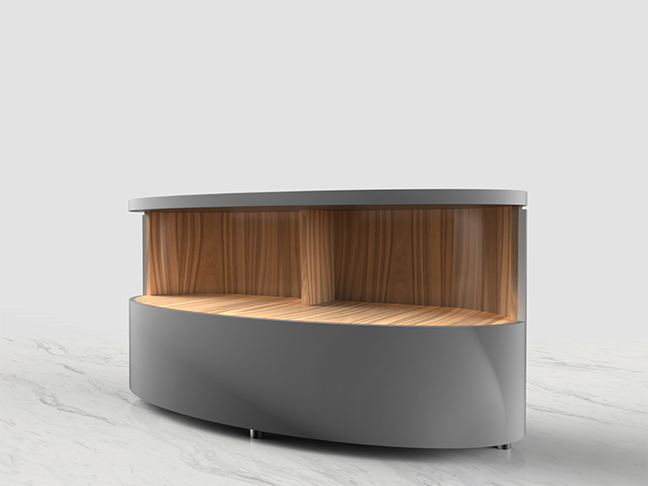
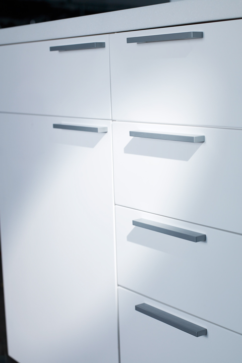
A repeated symbol or texture on a material creates movement that directs the viewer’s eyes, as well as ties the piece together as a whole. Pattern works closely with the principles of movement and repetition to form a cohesive, aesthetically pleasing design, such as the ripple patterns in our Wedge cabinets.
Repetition
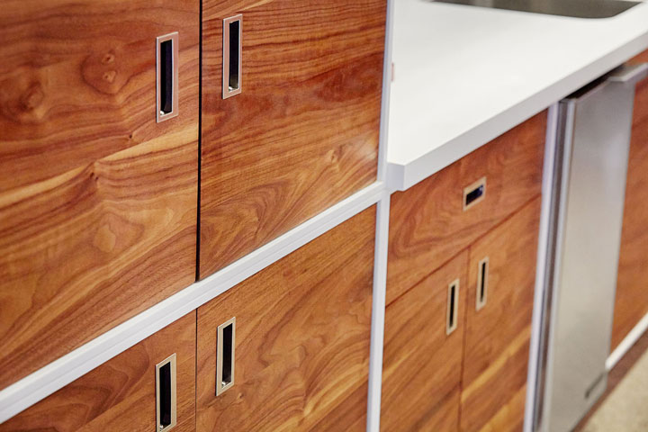
Using certain elements over and over creates the image of a unified piece. Whether the repeated element is a pattern, a texture, a shape or even an object, it further creates a cohesive design, such as the repeated shapes and sizes of the doors and drawers on our Wedge cabinets. Because the doors and handles are repeated throughout, it’s clear that the cabinet system as a whole belongs to the same piece.
Proportion
When all parts of an object relate well to each other in terms of size, shape and number, there is proportional unity in a piece.
In our casework using the Cube or the Curve, for example, the number and size of cabinets remains proportional throughout, which creates balance and homogeneity.
Rhythm
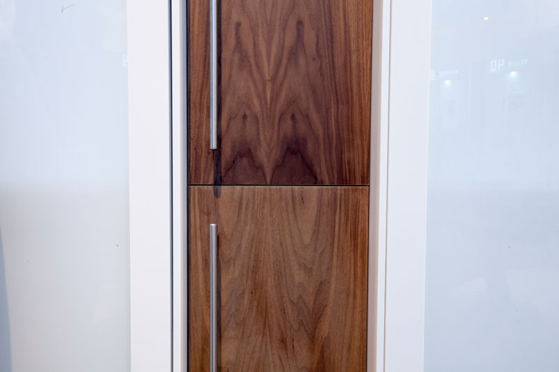
Drawing on the principle of repetition, rhythm uses repeated elements of design to “create a feeling of organized movement,” according to the Getty, establishing a mood and tone for the piece, as in our custom lockers.
Variety
In order to create this mood, a piece must have variety, which means using a number of elements in the design. This variety directs eye movement while holding the viewer’s attention.
In our customer lockers, we use different colors, textures, shapes and other elements to direct eye movement along the piece while creating a warm, clean feeling in the overall piece. The variety in the design holds attention and unifies the piece.
Unity
When properly used, these principles create a feeling of unity in the piece. All parts of a design should work together and create a sense of flow and completeness—the true test of great piece of work.
The principles of design are important to all designers, as effective use of these principles leads to an attractive, functional piece. We’ve applied the principles of design to all of our products—in different ways, depending upon the piece—which has contributed to the high style of our work.


Sorry, the comment form is closed at this time.