Shield brings unique designs to life
Mass production. Customization. A lot of folks will tell you those two worlds are separate. Well, luckily, we’re not a lot of folks. Working with Shield is unique in that we’re able to bring custom elements into a mass production world.
We’re designers. We’re former architects. We come from the construction world. We’re able to see a myriad of perspectives to help achieve a client’s needs. And with a material like solid surface, we’re able to build just about anything—unless it defies the law of physics. We haven’t quite cracked that one… yet.
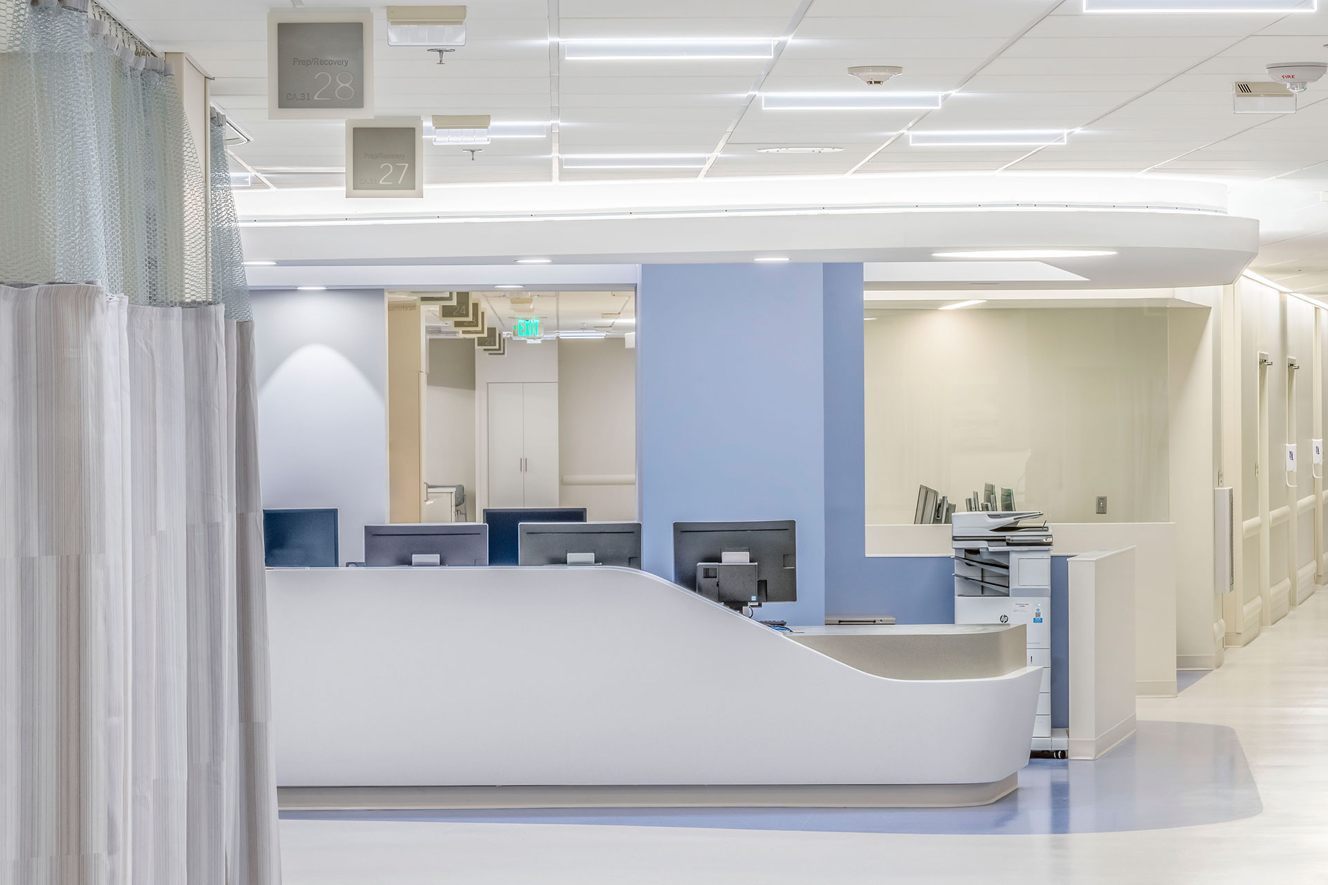
Cannon Design and JE Dunn created the space at the University of Kansas Hospital Cambridge Tower A but some of the solid surface work stalled in the mockup phase. The architect had drawn compound, complex curves on their nurse stations – with two different solid surface colors meeting in the middle of the curves – and the initial mockups didn’t make the cut.[vc_row row_type=”row” text_align=”left” css_animation=””][vc_column][vc_empty_space][/vc_column][/vc_row][vc_row row_type=”row” text_align=”left” css_animation=””][vc_column][vc_single_image image=”12934″ img_size=”full” add_caption=”yes”][vc_empty_space][/vc_column][/vc_row][vc_row row_type=”row” text_align=”left” css_animation=””][vc_column][vc_column_text]Our team came in and translated the design to reality with minimal changes. We even designed these desks to be modular builds that the contractor’s team could easily install on their own. The result? The nurse stations match the other curves in the design (e.g. the ceiling light cove) and we were able to help bring an integral part of the design to life, while also saving nine percent on the overall budget.
Shield shaped everything we built for the project—pass throughs, nurse stations, curved reception desks—in the same way. We also worked with the users and the design team to create a swiveling, dual-surface documentation station that uses less space in the OR while stile providing room for two people to work. The work surface that swivels allows the documenting nurse to follow the operating team as they move around the room.
Shield is not just about crafting something beautiful. What we build has to function. And more, it has to serve the needs of the user.[/vc_column_text][/vc_column][/vc_row][vc_row row_type=”row” text_align=”left” css_animation=””][vc_column][vc_column_text]We added phenolic tops to our casework, when KU Med required surfaces that could handle hazardous materials like acids.
For KU Med’s compounding labs and pharmacies we crafted open casework with wide spans before hitting a vertical, because staff working with those needed space flexibility.
We partnered with Cannon Design to create a patient headwall for the University of California, San Diego’s Jacobs Medical Center that was functional and beautiful. With solid surface, we were able to achieve the compound, curved design. Thermoformed solid surface material covers the entire headwall, including custom outlet covers, to ensure the headwall is easy to sanitize.[/vc_column_text][/vc_column][/vc_row][vc_row row_type=”row” text_align=”left” css_animation=””][vc_column][vc_empty_space][vc_single_image image=”12882″ img_size=”full”][vc_empty_space][/vc_column][/vc_row][vc_row row_type=”row” text_align=”left” css_animation=””][vc_column][vc_column_text]Shield brings high design and functionality to every project. We try to deeply understand what the client wants and needs, and craft our products accordingly. Help create a space your clinicians and patients will love by dropping us a line.


Sorry, the comment form is closed at this time.